Updated 16 October 2020: SHOW UP is over, as construction workers started to remove the boards to get vehicle access to the site.
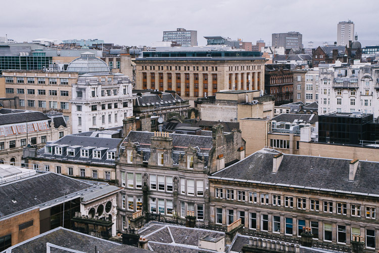
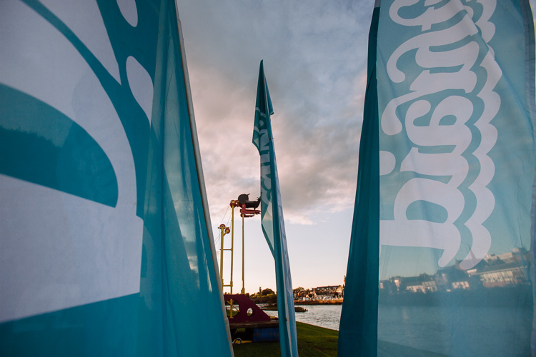
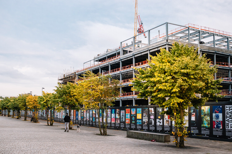
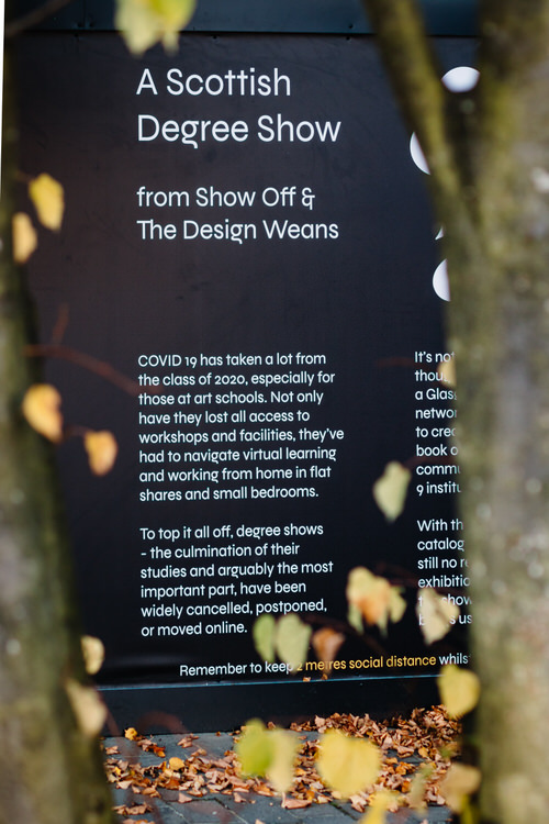
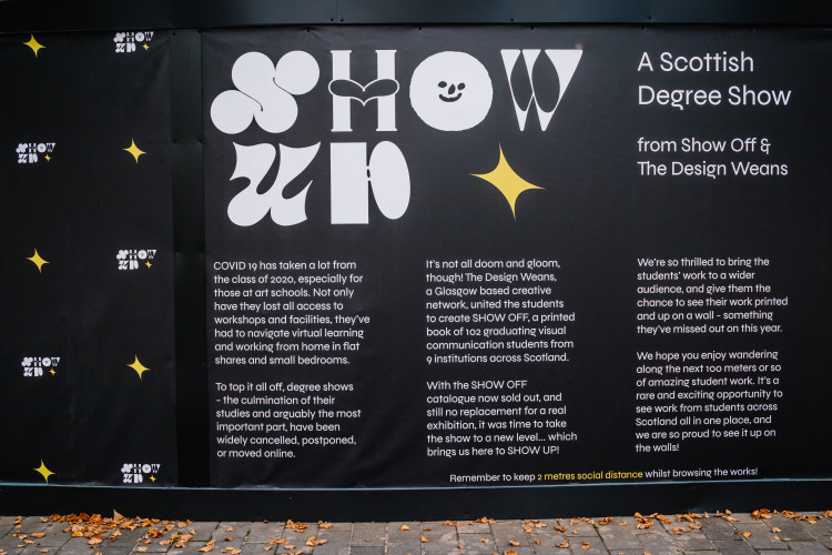
As Glasgow keeps experiencing back and forth lockdown restrictions this autumn, an unusual Covid-19 socially-distanced exhibition was held near Tradeston Bridge on the river Clyde. Named SHOW UP, it was an outdoor degree show on the perimeter walls the Barclays Campus for all-Scotland visual communication design class of 2020. SHOW UP was originally scheduled to run from 12 September till 14 October, but no one is going to rip it away from the wall so you still have a chance to view it.
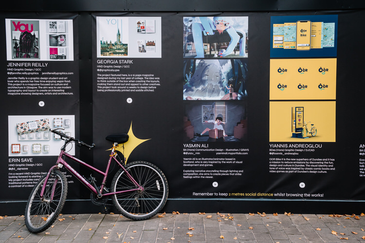
The Design Weans, a Glasgow-based creative network behind the exhibition, gave 102 students from 9 different institutions across Scotland a chance to see their degree work in print, on the wall, and to be seen in public, since usual end-of-year degree shows were either cancelled or moved online due to the pandemic.
There is a story behind this exhibition. It is born from an earlier not-for-profit project, SHOW OFF, a printed catalogue aiming to showcase the class of 2020’s final work across the whole Scotland in lieu of their cancelled degree shows. When interviewed on YouDoYou channel, a platform for Scottish creatives, Phoebe Willison and Mook Attanath of The Design Weans told Meghan Doran that they ran focus groups to find out what graduates wanted as a finale of their four years of study under the circumstances. The students wanted
- something to remember and celebrate
- something to show off to their family and friends
- something to help them to get employed.
It was decided, after some brainstorming and discussions, to go with a printed book/catalogue as this desirable “something”. The catalogue could be used as a keepsake for the grads and a show off piece for friends and family. Each student would get a free copy. At the same time design studios were asked to pay for their copy to be delivered to their doorstep. This would save them time travelling all across Scotland looking for talent and put students’ work in front of the future employers.
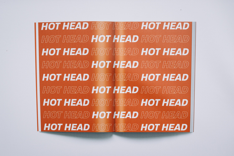
The name, SHOW OFF, was a clever play on words, as the injustice of the shows cancelled because of COVID-19 pandemic, was redressed by an opportunity to displays viscom grads’ work in print. The typeface chosen for the logo was a collaborative font where each letter was created by a different designer was found by Mook. It became a symbolic equivalent of 102 degree projects pulled together from 9 different institutions. After a successful Kickstarter campaign, the mission was accomplished!
As Phoebe shared in the interview, with SHOW OFF The Design Weans wanted to create an experience so that one would dedicate time to the book as if it was a degree show. Thus, they developed an interesting referencing system where you could go from a student’s page to another student from the same institution, or to a similar branch of design, or at random. The aim was to give a journey experience, to “physicalise” (in Phoebe’s words) the book.
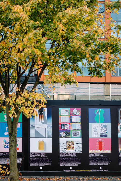
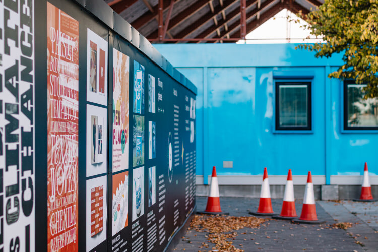
However, there are inherent codes of visibility and recognition in artworld, and these codes imply a desire to be seen on the wall, in an art space. Hence, as the strict lockdown was over, SHOW OFF transformed itself into SHOW UP – an outdoor milestone exhibition showcasing students’ work to a wider audience. Kieran Vernal, a Glasgow-based graphic designer, re-used the font and materials already submitted for the catalogue, to orchestrate a long sequential wall-based display that occupied a considerable stretch of the Barclays Campus perimeter.
Now, SHOW OFF-the book sought to replicate the “intra muros” code of visibility, that is the final degree show as if held within the institutional walls, within the community of teachers, peers and family, within a virtual art space required to give legitimacy to the graduates’ work in front of design professionals and potential employers.
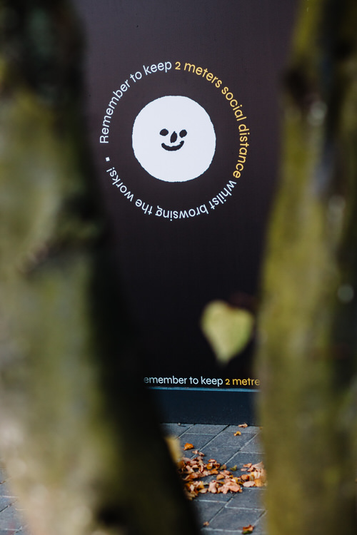
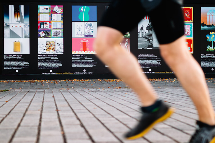
In contrast, SHOW UP-the exhibition drew the young designers’ projects out of the intramural art nest, into a non-art space – onto a construction site fence, essentially. The work went up on the wall, so the “mural” code was preserved, but the space, an in-between-bridges transit zone for dog walkers, passers by, cyclists and joggers, was distictly “extra muros” – outside the institutional walls, outside the art community, publicly visible.
This is the space, in which visual communication design usually thrives, as designers have to operate under the pressure of attention economy, make their work memorable and — only as a final step — to communicate their message.
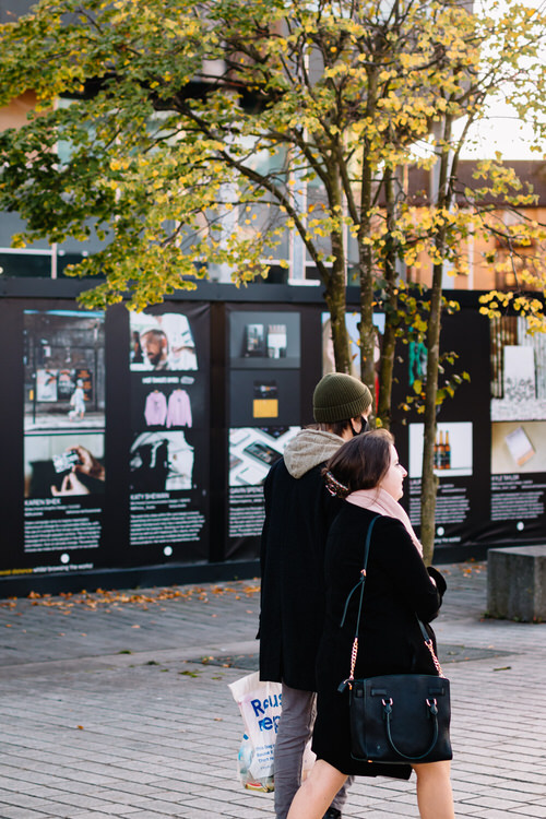
John and I noticed a long row of colourful posters from the other side of the river at the end of our Sunday walk, but, realising that it would probably take up at least two hours to view the exhibition properly, decided to come back the next day.
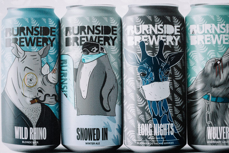
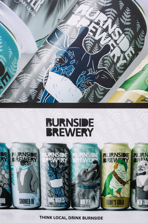
We did spent several hours strolling along that wall, looking at the young designers’ projects and sharing each other’s favourites and taking some notes and photos for reference, to look people’s work up later at home. I ended up admiring the Burnside Brewery rebranding project by Jonathan Charles, BA (Hons) Communication Design graduate from GRAYS. I thought that the new logo incorporating the fern, a symbol of sincerity, to signify good, honest, locally crafted beer, and the way the fern pattern was subtly added to the cans’ background. The new illustrative animal labels were engaging, with a masked giraffe on the can of the pale ale called “Long Nights” to celebrate the NHS services.
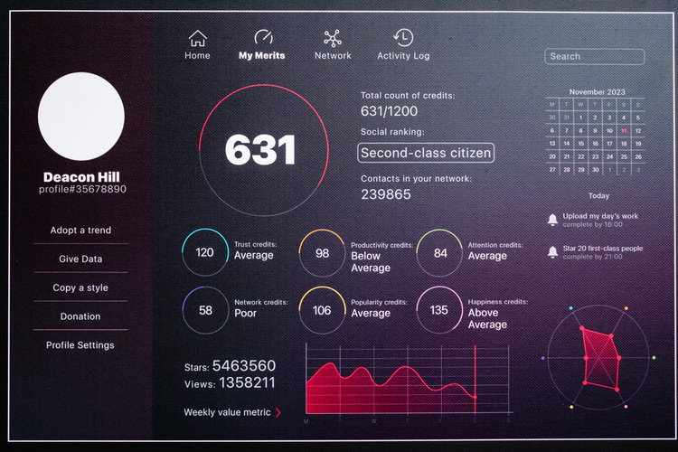
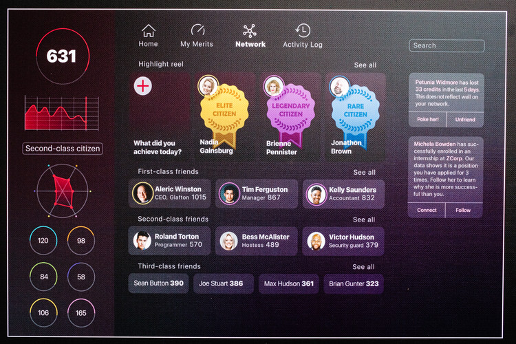
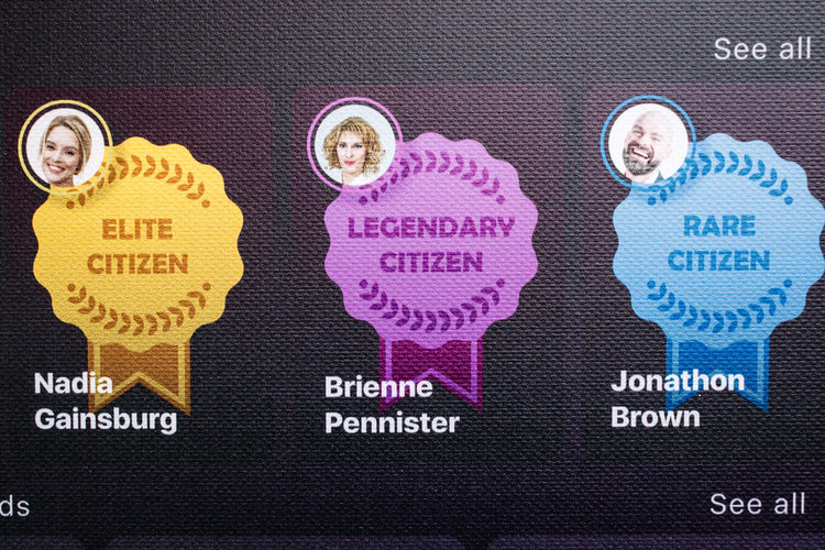
As a data analyst, well-aware of potential dangers of big data analysis and AI and gamification of disciplinary mechanisms, John was drawn to the work of Kamilla Hu-Yang, BA (Hons) Communication Design graduate from Glasgow School of Art. Kamilla was one of the students whose degree show was moved online, and this is the case when her conceptual project Perfect Citizen was right at home there, although, in my opinion, a sequence of screenshots works in the context of SHOW UP outdoor exhibition quite well too.
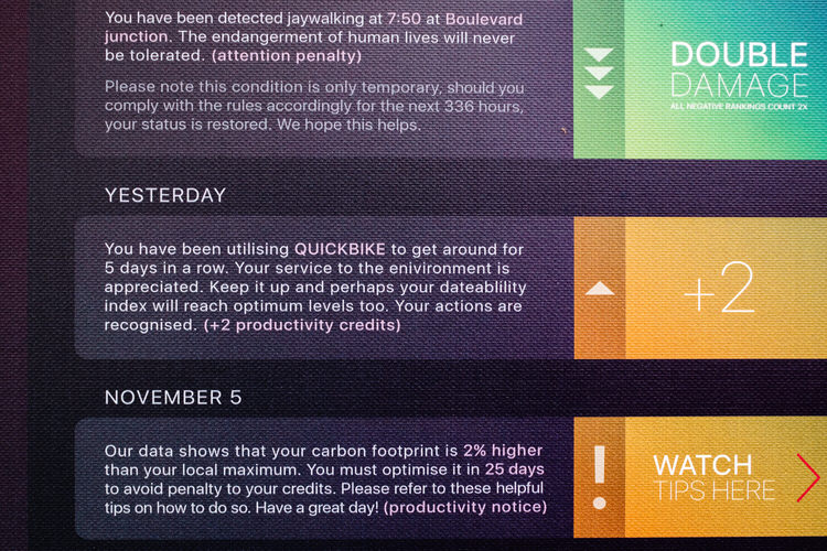
She created a website and mobile app user interface for an imaginary social credit system underpinning a chilling technological dystopia of total surveillance, online and offline. All surveillance data is pulled into a centralised database, human activities are assigned with actual values that can be added or deducted, and every citizen is given a numerical score calculated by computer algorithm.
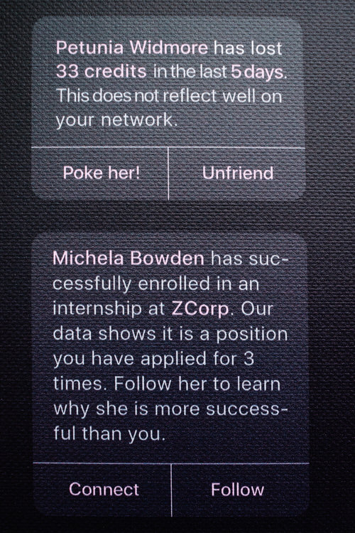
We are immersed into a fascinating life story of Deacon Hill, a Second-class citizen, who is encouraged by the system to shame or unfriend his unsuccessful friends and learn from the ‘elite’ paraded on his ID page in a prominent ‘highlight reel.’ He has points deducted for being late to work and jaywalking, and is warned about the coming up penalties if he does optimise his carbon footprint in 25 days. All his activities are logged. Starring and following first-class people in his network, a social media analogue, is not voluntary, but a daily duty to be completed by 21:00. The goal of the system is to create a ‘perfect citizen.’ As Kamilla writes,
The idea of a social credit system fosters a public opinion environment, leading to a loss of agency and public shaming. In this project I explore different scenarios. I look at whether this phenomenon potentiates a culture of honesty and safety, or a society of deceit through representation and conformity. What happens to the maverick?
You can enhance your experience of Kamilla’s exhibition poster with augmented reality in situ by using Artivive app (some other designers in the show also provide extra AR contextual data with this app) – or watch her Vimeo video online where she satirises the system’s continuous corrective notifications to Deacon Hill as he goes on with his life.
We already live in a digital surveillance society only one step removed from the institutional visibility of Jeremy Bentham’s Panopticon. According to Ivan Manokha, “Bentham’s discussion of his project of Panopticon involves three key elements: the omnipresence of the inspector ensured by his total invisibility; the universal visibility of objects; and the assumption of constant observation by the watched.”1
Now, do we not assume that there will be a CCTV camera more or less everywhere we go in the city? That every time we post on social media, our data is monitored and converted into ads, as well as out Google searches? That our friends and family networks is the data capital adding market value to Facebook or Instagram? That our card payments allow tracing where and what we buy? That our mobile phones record our GPS coordinates? That every time we tap “I agree” in a cookie consent pop-up, we give up our right to privacy and our private data is collected? Do we not abstain from visiting some websites out of fear of being watched?
Our watchers and data collectors are ubiquitous and invisible. At the moment our personal information is stored across multiple services and networks, but already the data is “liquid” – it can be be sold or handed over from one agency to another without our knowledge. Attach facial recognition and biometrics to a centralised database – and you have a platform for the social credit system, just like the one Kamilla conceptualises in her Perfect Citizen project.
Seeing that the issue of total surveillance resonated with me, when we got home John unearthed his old copy of The Foucault Reader2 for me to read further on Panopticism, and, with the introduction of the COVID-19 track and trace system implemented, on Foucauldian concepts of governmentality, biolegitimacy and biopower. Perhaps I’ll apply this knowledge later when writing about the “new normal” aspects of Glasgow in lockdown. For now, let’s continue discussing the SHOW UP outdoor exhibition.
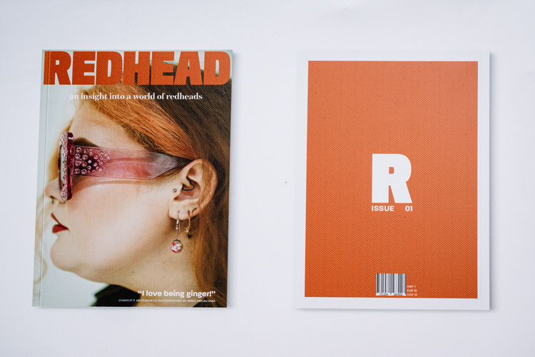
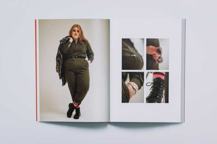
The next project we both noticed was Alex Wood’s design of a contemporary magazine Redhead dedicated to “the beauty of ginger people and their fashion sense” and provided “insight into a world of redheads.” We liked it because I am a redhead, I wear olive and terracotta colours and appreciate the “insight”, so it was a bit of personal bias. However, we also picked it because Wood, BA (Hons) Communication Design graduate from GRAYS, showed an impressive range of skills and ingenuity while creating his magazine – as an art director, interviewer, designer and typographer. Working around the lockdown contraints, Alex asked models to take photos of themselves (wasn’t there some famous fashion magazine who also published an issue with model “selfies” during the quarantine?) to feature on double-page spreads. After each model’s section there was a typography spread playing with various phrases about redheads.
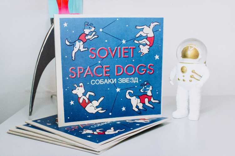
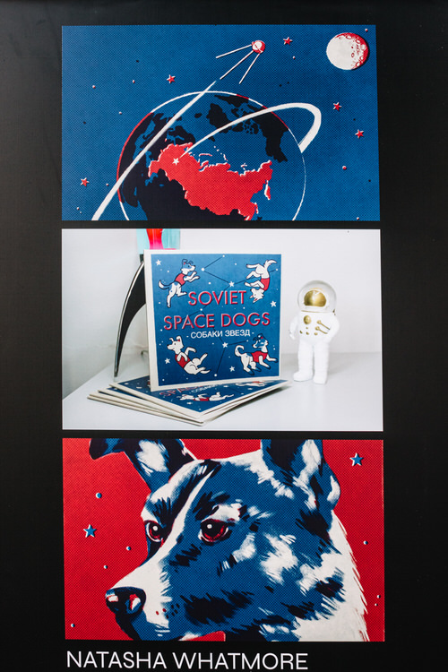
We both love dogs so I wasn’t surprised when John called: “Look, darling, there is something about Soviet space dogs and Laika here!” That personal perspective rules!!! Natasha Whatmore, BA (Hons) Illustration Design grad from GRAYS, came up with a final year educational book project to tell a lesser know story of the space race involving these beautiful creatures, including the heroic Laika, a “quiet and charming” stray from the streets of Moscow, who was sent to orbit in 1957 to test the impact of open space on living beings. We appreciated the retro touches in Tasha’s design – she tried to replicate 1950s and 60s screen printing and risograph look for this book, drawing inspiration from Soviet posters and retro matchbooks. You can enjoy vintage details and rest of the book’s layouts by watching this short YouTube video.
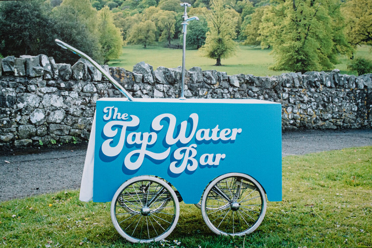
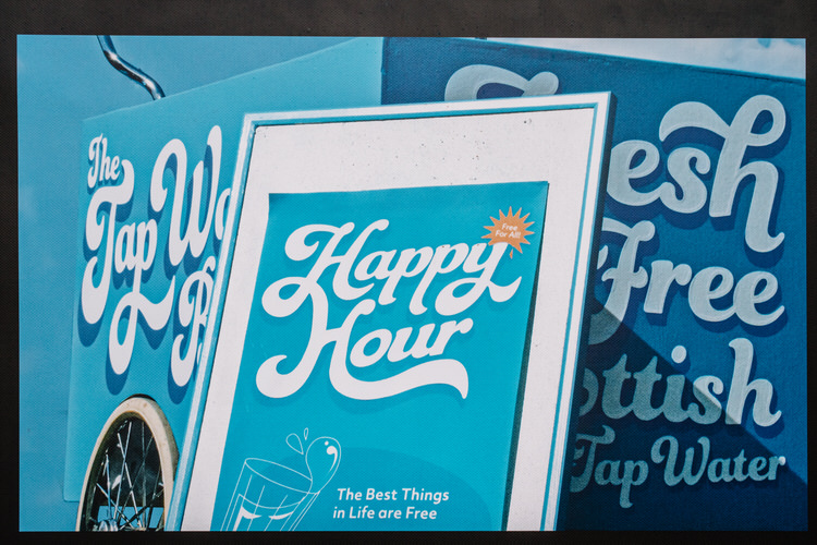
Robyn Young’s Tap Water Bar project was inspired by her 3 months internship with Scottish Water. After we had moved to Glasgow last year I wandered into Your Water Your Life campaign event at George Square where I saw top up water taps in use. I was gifted a free reusable bottle and had a friendly chat with a Scottish Water staff member about how we should drink pure water from the tap and reduce reduce plastic waste produced by buying pre-bottled water. So when I saw Robyn’s design ode to “excellent, clean, clear and most importantly available for all” Scottish natural resource, I felt the connection. A first-class BA graduate from NAPIER built a tap water bar on wheels to make Edinburgh people appreciate their free water, accompanied by a takeaway graphic pack, and to start conversations on the street.

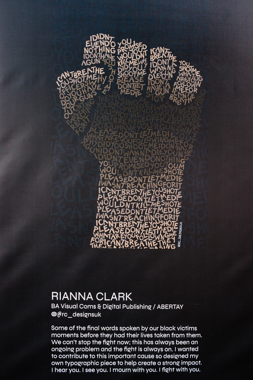
An honorary mention goes to Riana Clark, BA Visual Communications and Digital publishing graduate from ABERTAY, with her Black Lives Matter-themed poster. Riana took the last words of black victims of police brutality before their death
I can’t breathe
You shot me
Officers, why do you have your guns out?
You promised you wouldn’t kill me
I wasn’t reaching for it
I don’t wanna die young
I wasn’t even doing nothing
What are you following me for?
I don’t have a gun
and turned them into a typographic piece to remember them and raise awareness about the BLM movement. It fitted the spirit of the place as the banks of the river Clyde had lots of anti-racist graffiti and banners back in June. The Clyde amphitheatre in the vicinity held a peaceful Justice For George Floyd protest. Riana’s SHOW UP poster is a reminder that racism is not a temporary problem and has to be reminded of persistently.
There were lots of other talented designers whose work we enjoyed just as much but not included in this essay – please visit the show yourself and I am sure you’ll pick your own favourites out of over a hundred entries. After all, not everyone has ginger hair, likes animals on beer labels, worries about digital surveillance and attended a Scottish Water campaign in the past. We are all different…
- 1.Manokha I. Surveillance, Panopticism, and Self-Discipline in the Digital Age. SS. Published online July 15, 2018:219-237. doi:10.24908/ss.v16i2.8346
- 2.Rabinow P, ed. The Foucault Reader. Penguin; 1986.